About the Brand
Buffalo Bison is a team identity built around raw strength and fearless energy. The bison logo is bold, aggressive, and unshakable. Just like the city and the fans it represents. The teal and black color scheme brings a modern twist, while the design still carries that tough, gritty edge you’d expect from a franchise rooted in tradition. Buffalo Bison is more than just a name, it’s a statement of power, resilience, and pride, created to stand out on the field and in the culture that surrounds it.
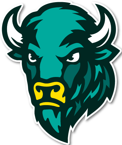
Behind the Logo
The logo was designed to capture power and attitude in a single mark. With sharp lines, strong features, and a bold color palette, the bison’s expression shows toughness and determination, the kind of energy you’d expect from a team built to dominate. The teal and black combination gives it a fresh, modern edge, while the yellow accents bring extra punch and balance. Altogether, the logo stands as a symbol of strength, pride, and identity, made to look just as good on a helmet as it does across merchandise and branding.

Uniforms
The uniforms were designed to balance tradition with bold modern energy. The Home set features the signature teal base, accented with Stampede Gold numbers and Prairie Mist striping on the sleeves, a look that reflects the strength and vibrancy of the brand’s core colors. The Away set flips the palette, introducing a clean white foundation with teal numbering and gold accents, ensuring the team’s identity remains strong no matter the field. Both designs showcase streamlined details and typography that tie back to the Bison’s visual system, creating a consistent and powerful game-day presence.


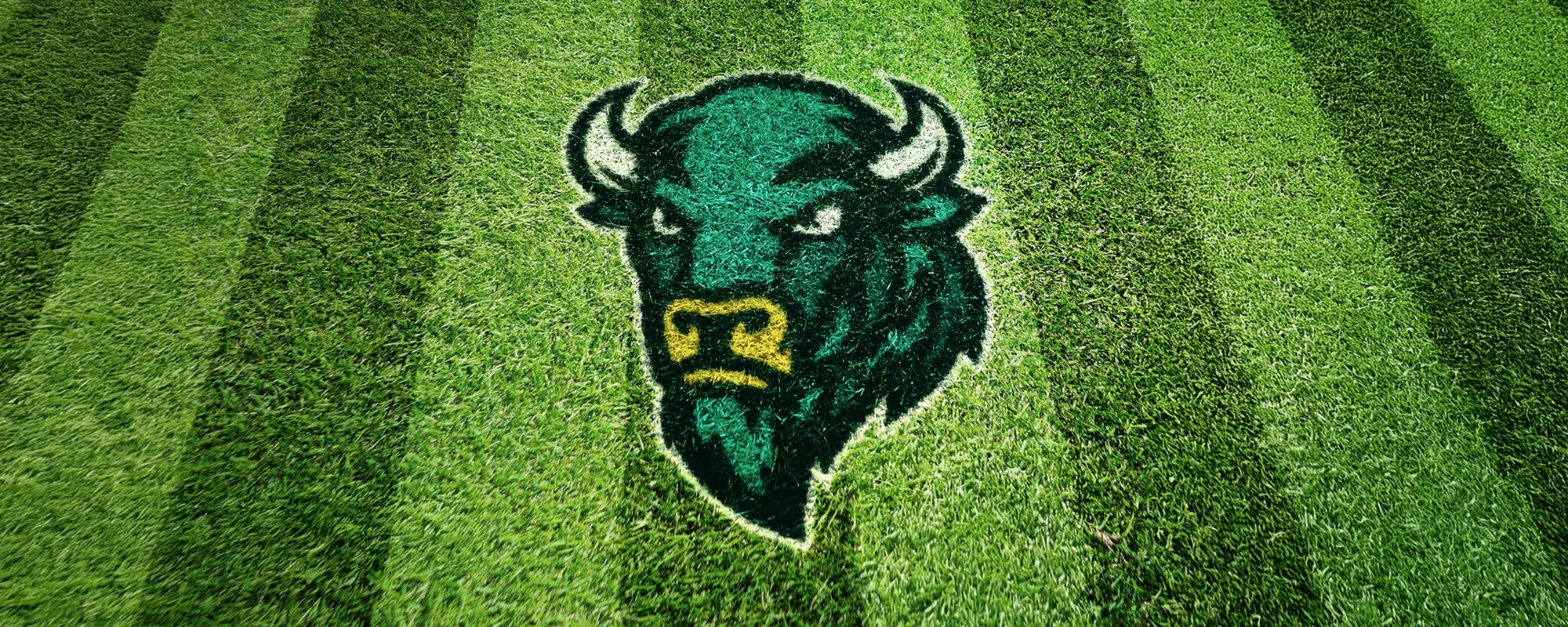
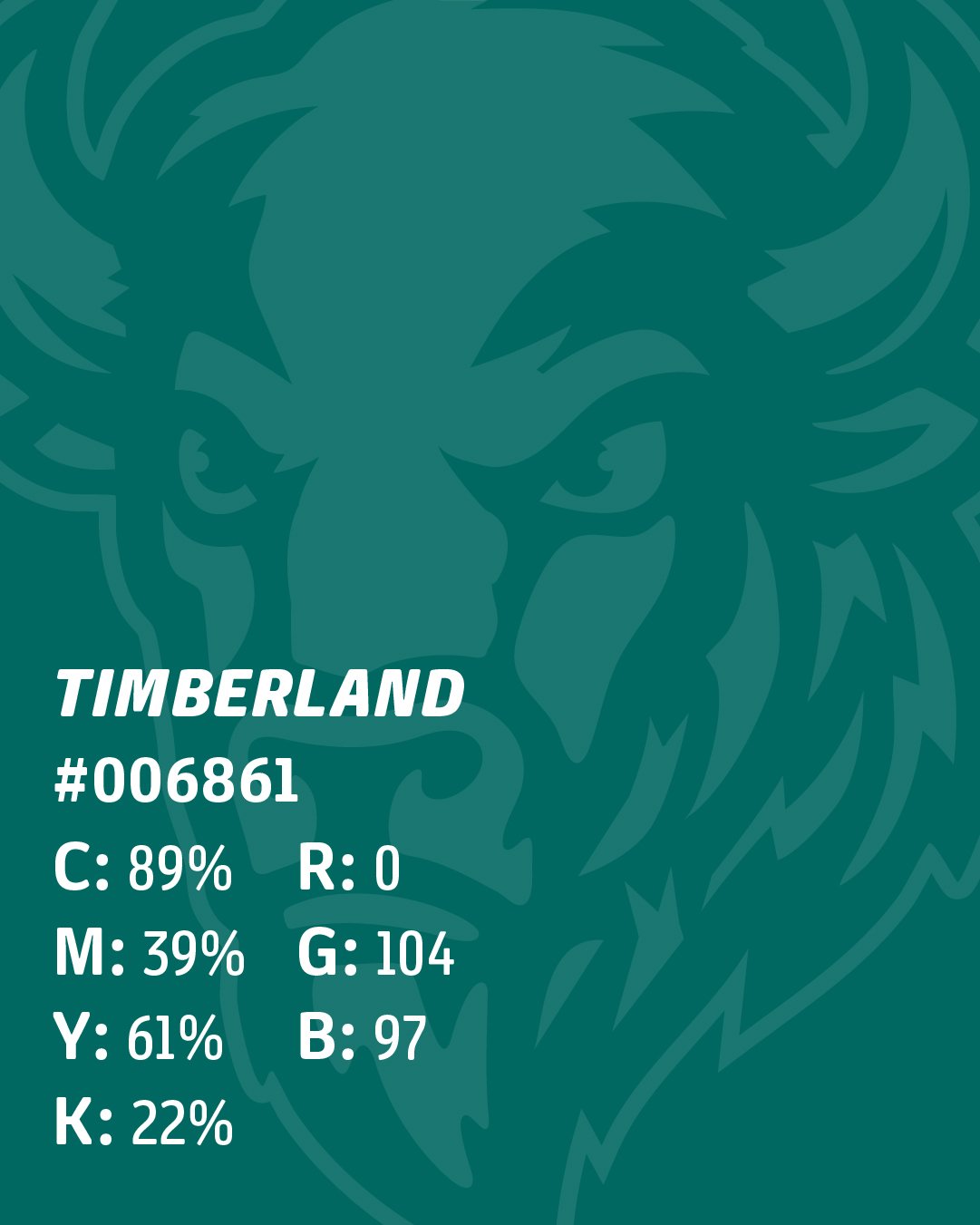
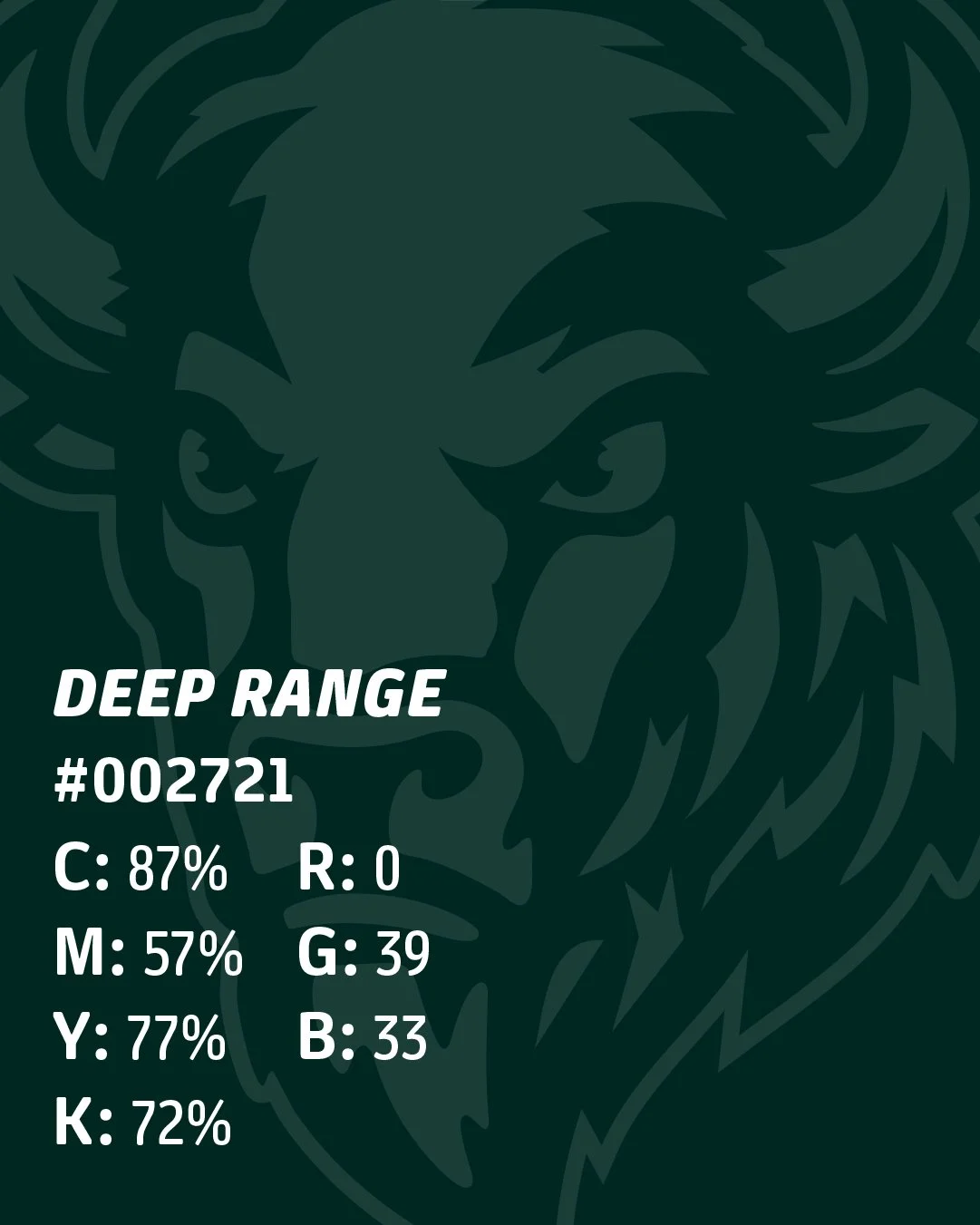
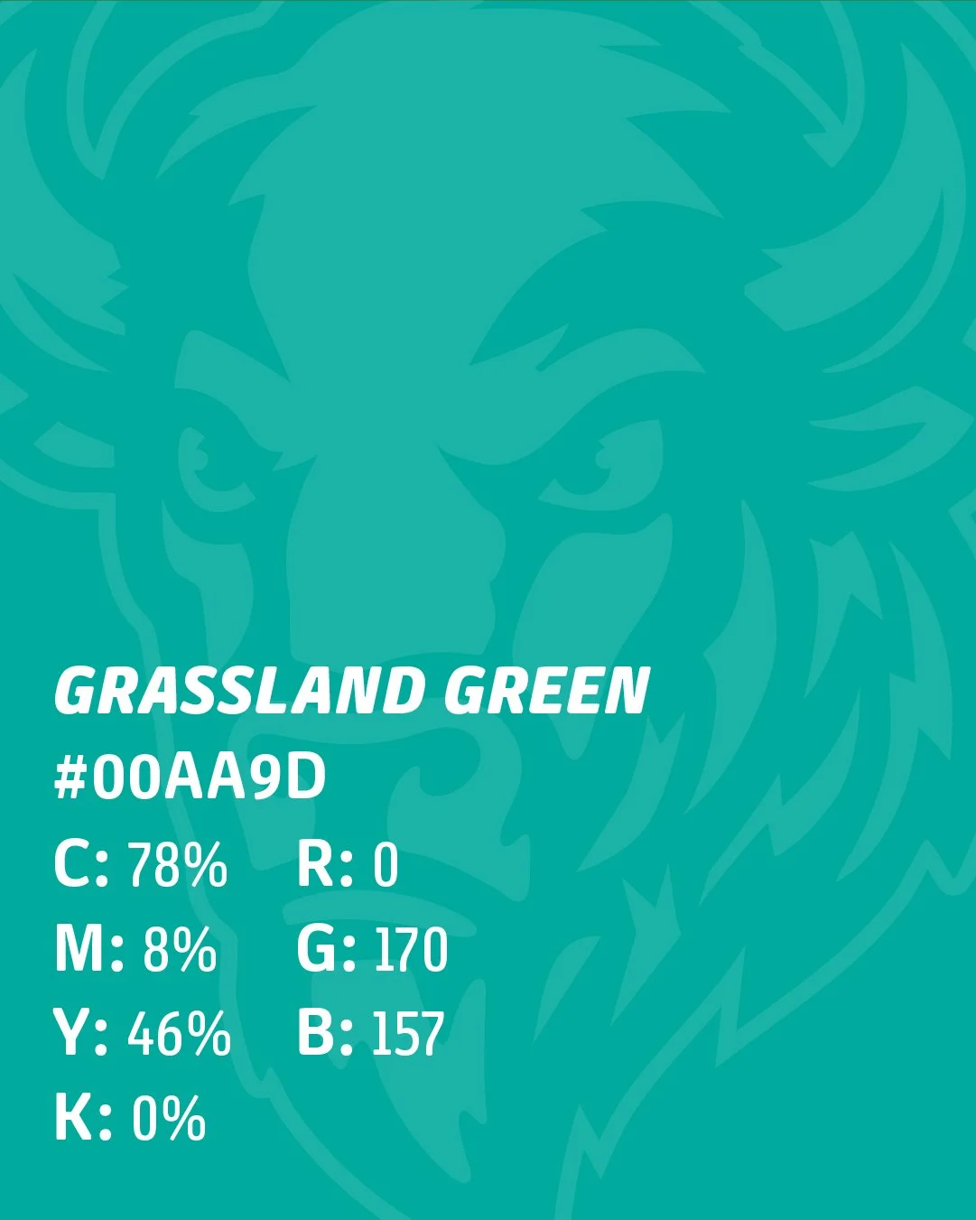
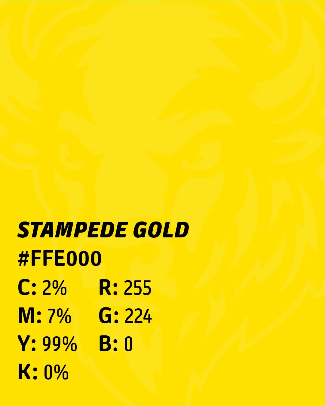
Color Scheme
The palette is built around earthy greens and strong yellows that capture the spirit of the plains and the power of the herd. Prairie Mist provides a soft, neutral base that balances the stronger tones. Stampede Gold brings high-energy accents that stand out across designs. Grassland Green is the core identity shade, while Timberline adds depth and contrast. Finally, Deep Range grounds the palette, giving weight and stability to typography and key elements. Together, these colors reflect resilience, strength, and pride: the core values of the Buffalo Bison brand.
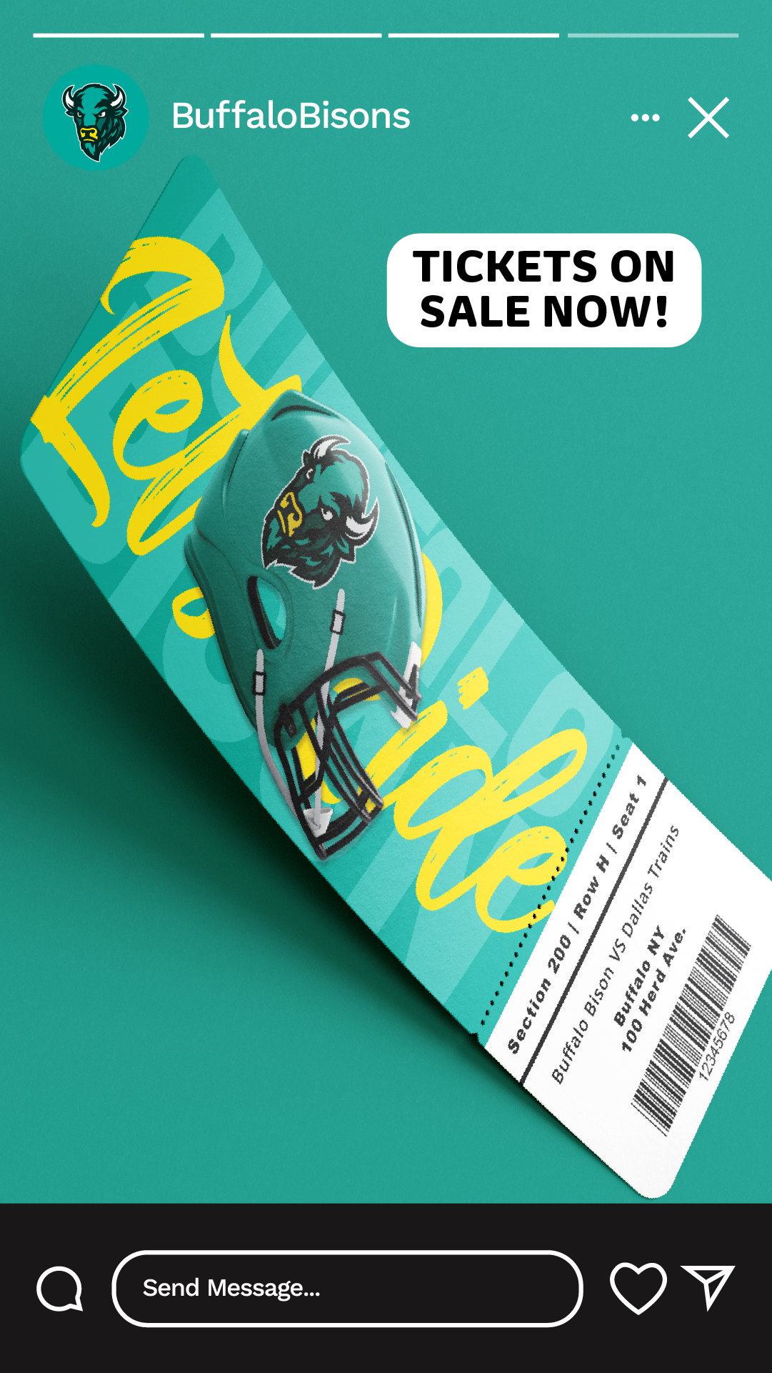
Social Media
Designed to bring the energy of Buffalo Bison to life in a bold, engaging way. Each post and story highlights the grit, pride, and excitement of the brand. From powerful close-up visuals of the team identity to vibrant promotional graphics and fan-focused content. The goal is to create scroll-stopping moments that connect with our audience, celebrate the culture of the herd, and build anticipation for what’s next. Whether it’s announcing tickets, showcasing game-day atmosphere, or rallying fans with shareable graphics, our social strategy makes Buffalo Bison impossible to ignore.