
Phoenix Lawnscaping
About
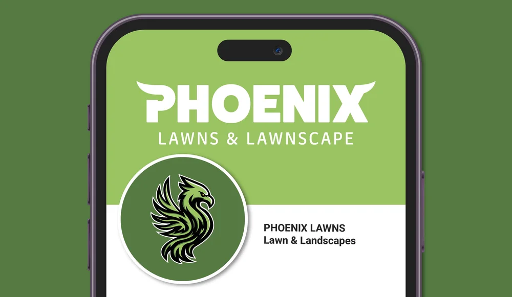
Phoenix Lawncare is a South Jersey lawn care company focused on dependable residential and commercial service, from regular weekly cuts to seasonal cleanups. The goal was to give the brand a stronger identity that feels trustworthy, local, and easy to recognize while still keeping that approachable neighborhood feel you expect from a small business.
Brief
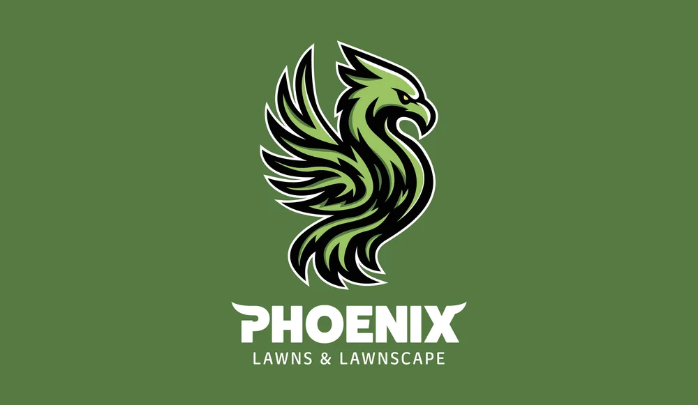
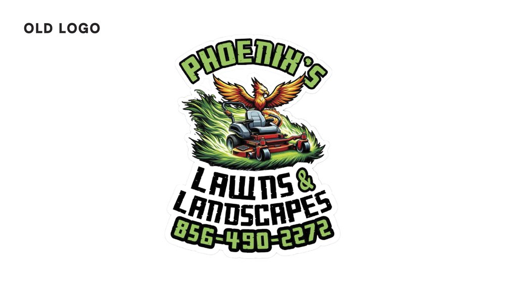
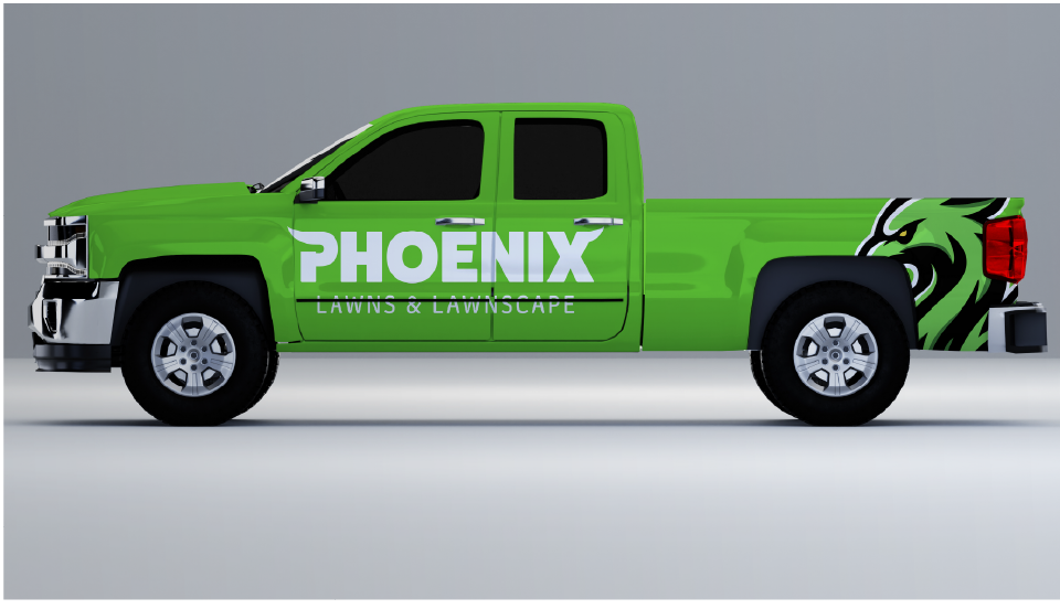
The main objective was to refresh the existing logo and bring the brand up to where the business is today. I wanted the design to feel cleaner, bolder, and more professional while still keeping that friendly personality that connects with local homeowners. It needed to stand out on trucks, signage, and uniforms while staying simple enough to be recognizable from a distance.
Solution
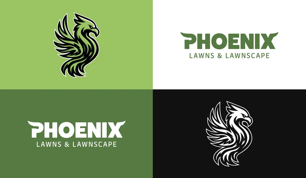
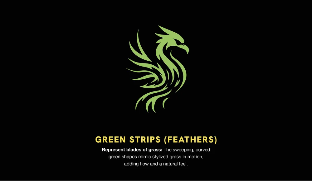
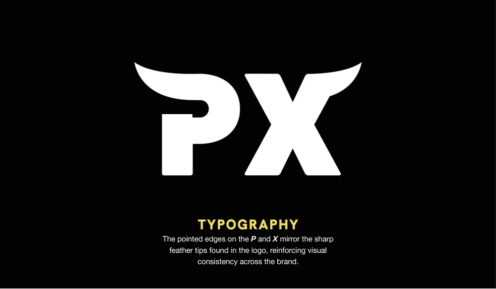
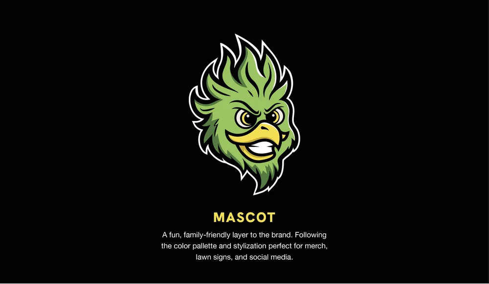
I developed a refreshed visual identity that balances strong branding with a clean, modern look. The updated logo improves readability and scalability while creating a more cohesive presence across all applications. The result is a brand that feels more established and confident, helping Phoenix Lawncare stand out while still feeling local and approachable.
Services
- Logo