Fairbanks
Wolves
About the Concept
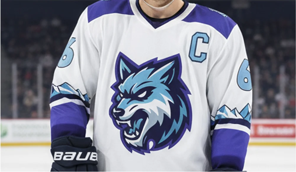
Fairbanks Wolves is a concept I created for a fictional expansion hockey team based in Alaska. The goal was to explore what a modern identity could look like for a new franchise while leaning into the environment, culture, and intensity you’d expect from a northern team. I wanted the branding to feel bold, aggressive, and built for the ice while still having a clean, professional sports aesthetic.
Brief
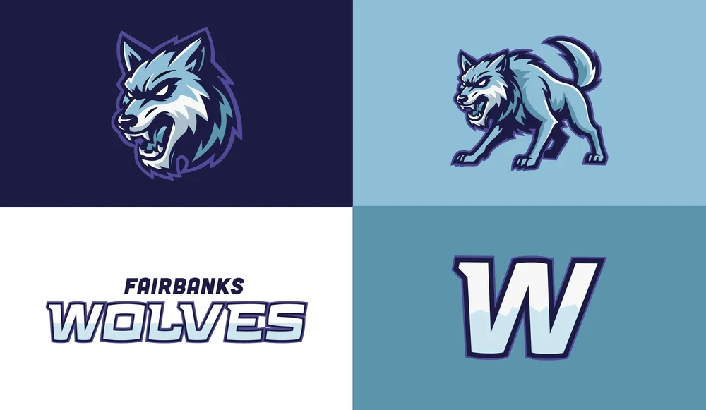
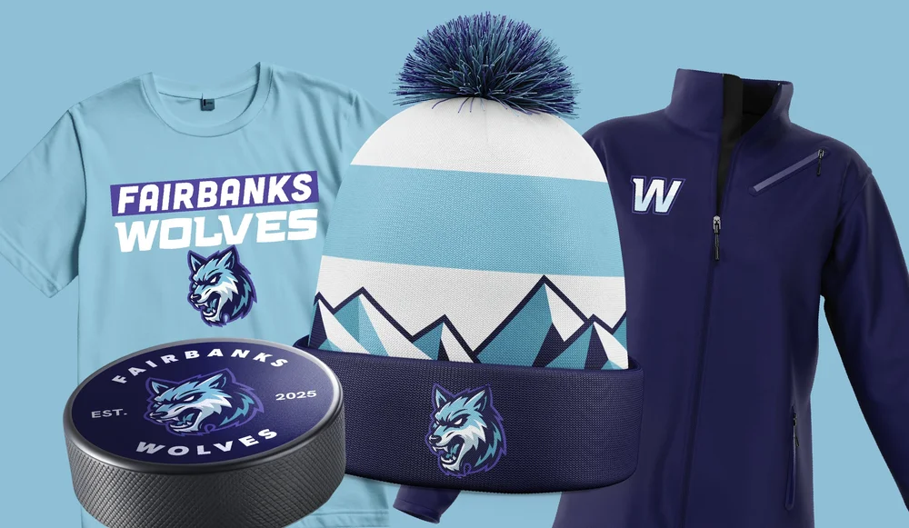
This project started as a creative exercise to design a full identity system for an expansion team from the ground up. I focused on creating a strong mascot logo, supporting marks, and a flexible visual system that could translate across jerseys, merchandise, and promotional materials. The design needed to feel authentic to hockey culture while standing out from existing teams through color, energy, and character.
Solution
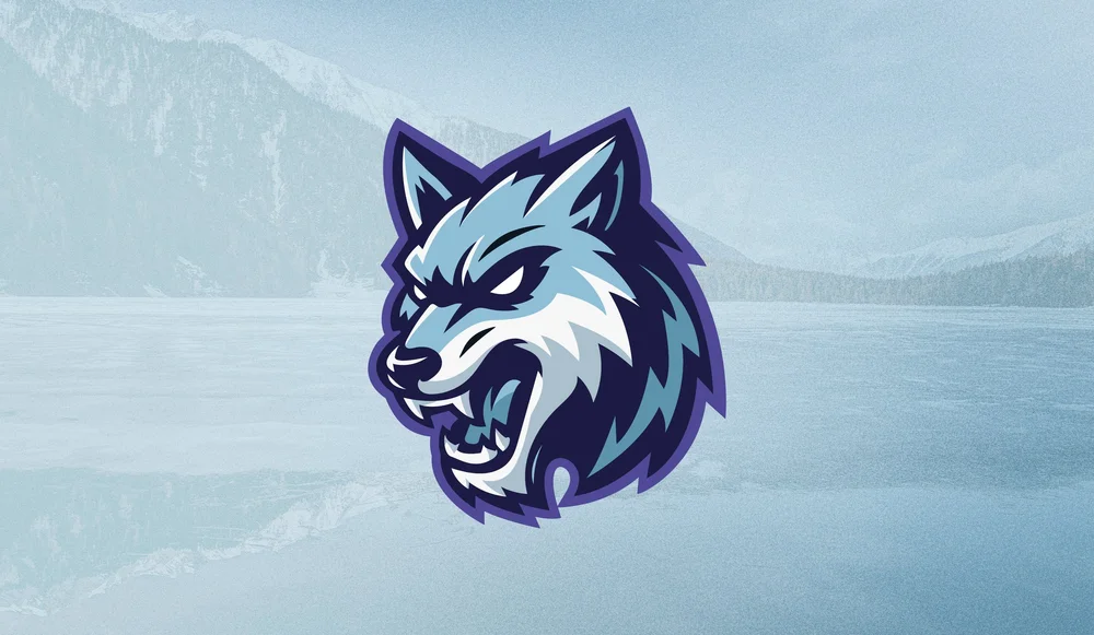
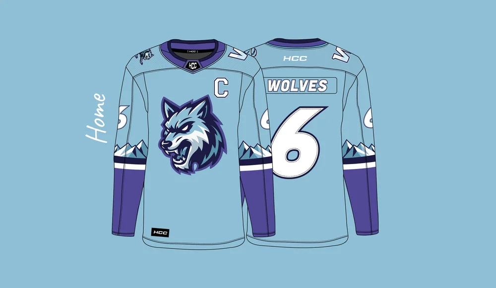
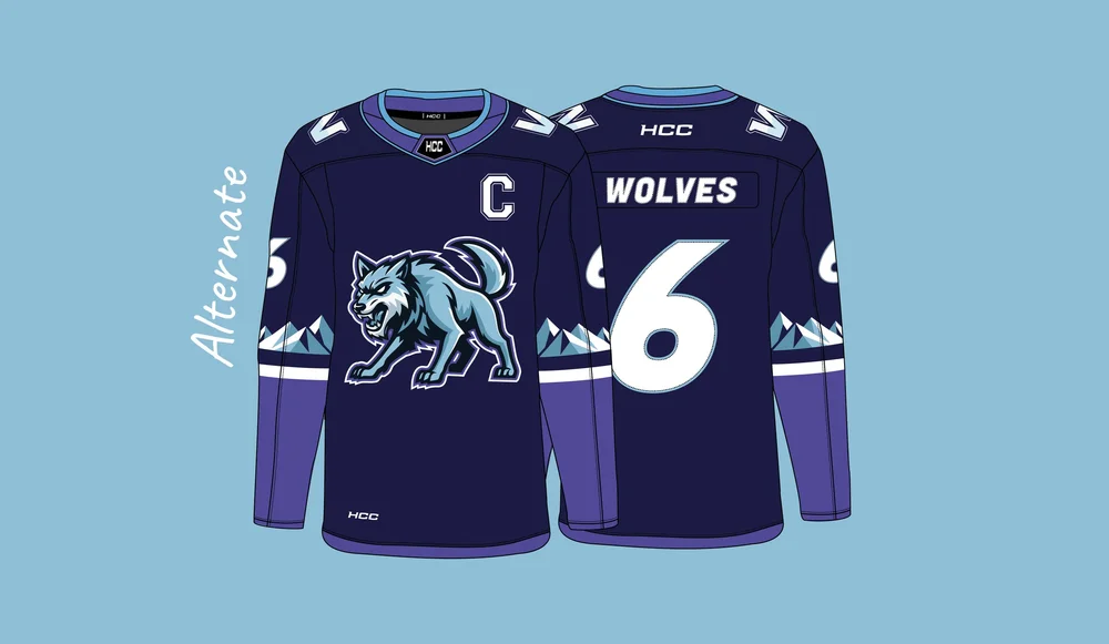
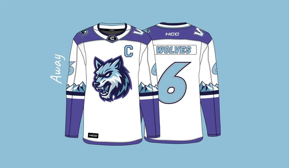
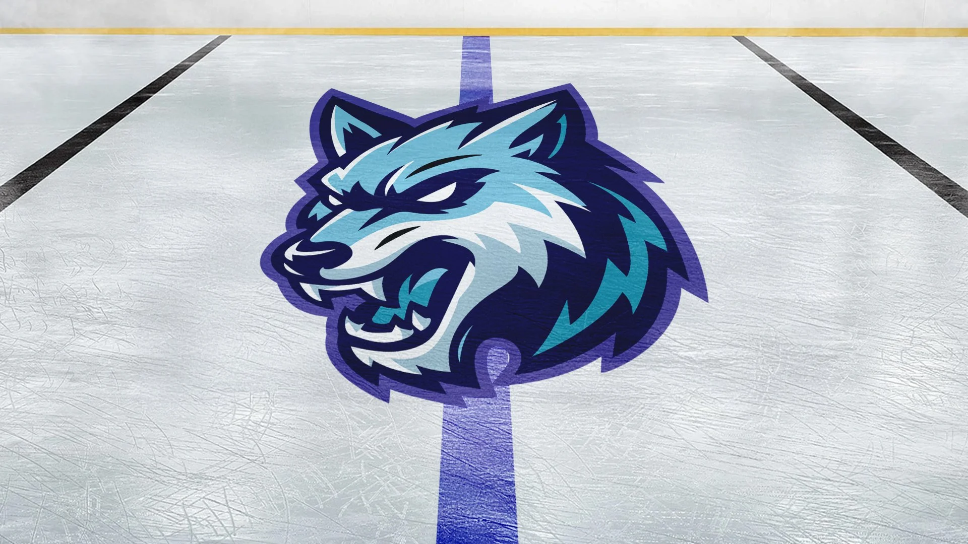
I developed a dynamic wolf mascot inspired by arctic environments, combining cool-toned blues and purples to reflect icy landscapes and northern lights influences. The identity includes primary and secondary logos, custom typography, and a full uniform system designed to feel cohesive across home, away, and alternate jerseys. The result is a modern expansion team concept that balances aggressive sports branding with clean, adaptable design built for real-world application.
Services
- Concept
- Branding
- Logo
Color Scheme
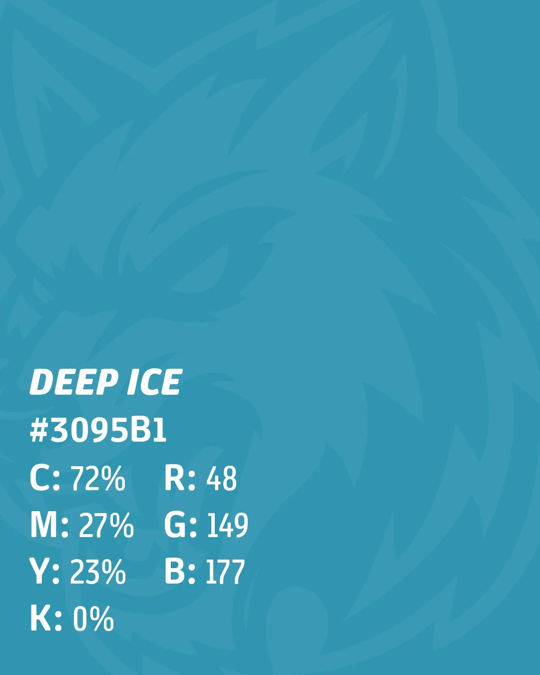
The palette draws inspiration from the Arctic landscape: cool blues, deep purples, and icy undertones that capture the fierce beauty of Alaska. Iceflow serves as the light foundation of the system, representing frozen lakes and the cold air. Deep Ice adds contrast and clarity, mirroring the sharp edges of ice and movement across the rink. Aurora Violet introduces the vibrant energy of the northern lights, adding personality and atmosphere to the identity. Finally, Midnight Aurora grounds the palette with strength and depth, giving the brand its bold, dominant tone.


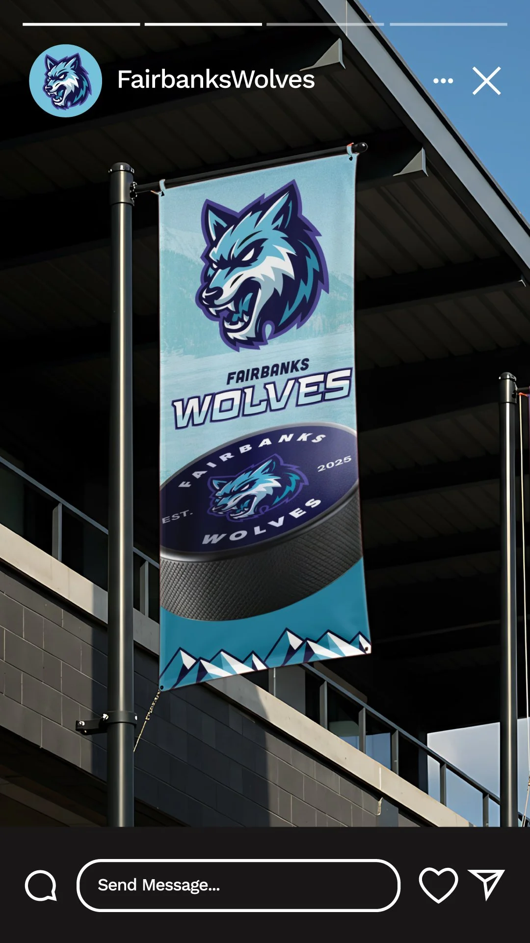
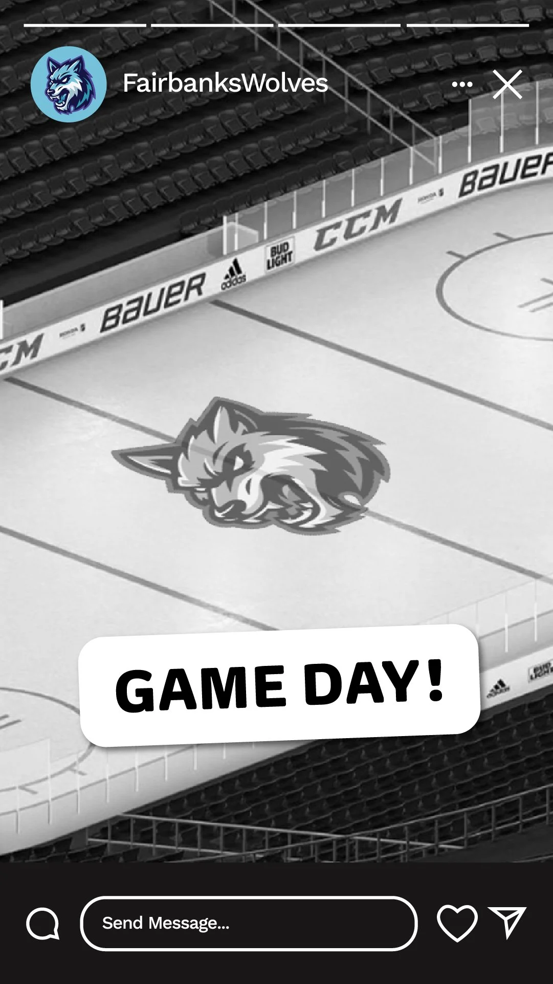
Social Media
Our strategy focuses on creating scroll-stopping moments that feel as powerful as the logo itself. Whether it’s announcing new uniforms, sharing behind-the-scenes looks, or rallying fans with sharp, animated content, the goal is to keep the Wolves’ community engaged and inspired. The mix of icy blues, aurora purples, and crisp typography ensures every post feels unmistakably Fairbanks.