

Ghostlight
Brewery
About
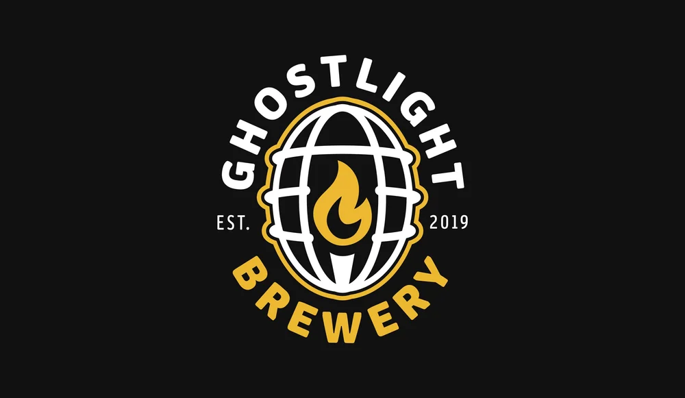
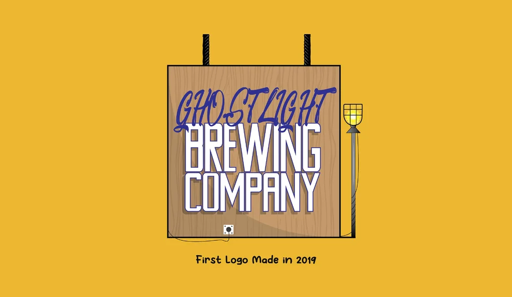
Ghostlight Brewery started as a college project I created with a couple of friends who were theater kids launching their own brewing concept. They wanted the brand to feel bold, creative, and a little different from traditional brewery identities. The idea of a “ghostlight” — a symbol tied to theater culture and creativity — became the core inspiration, giving the brand a unique story while still feeling strong and recognizable within the craft beer space.
Brief
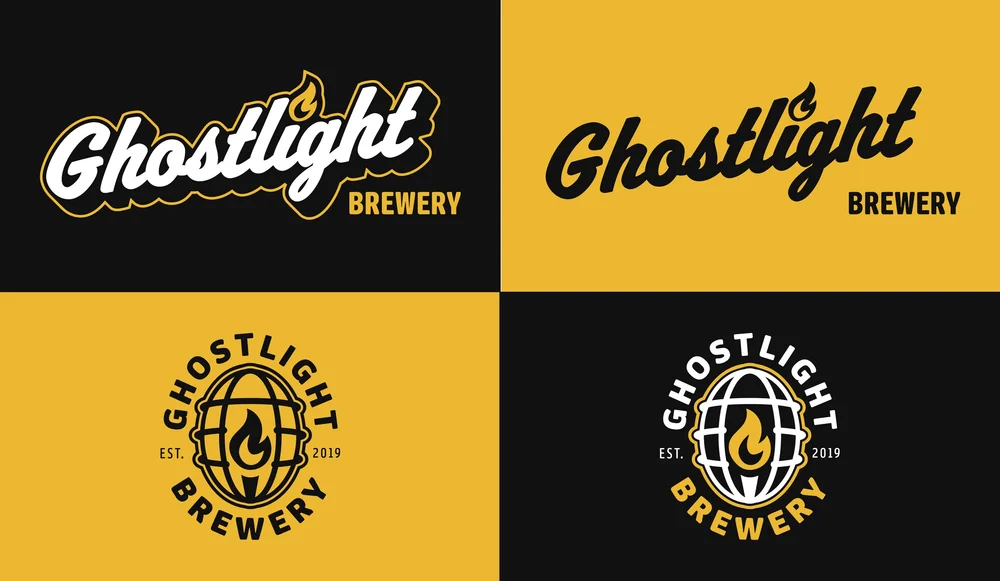
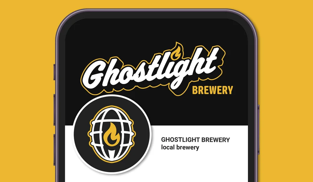
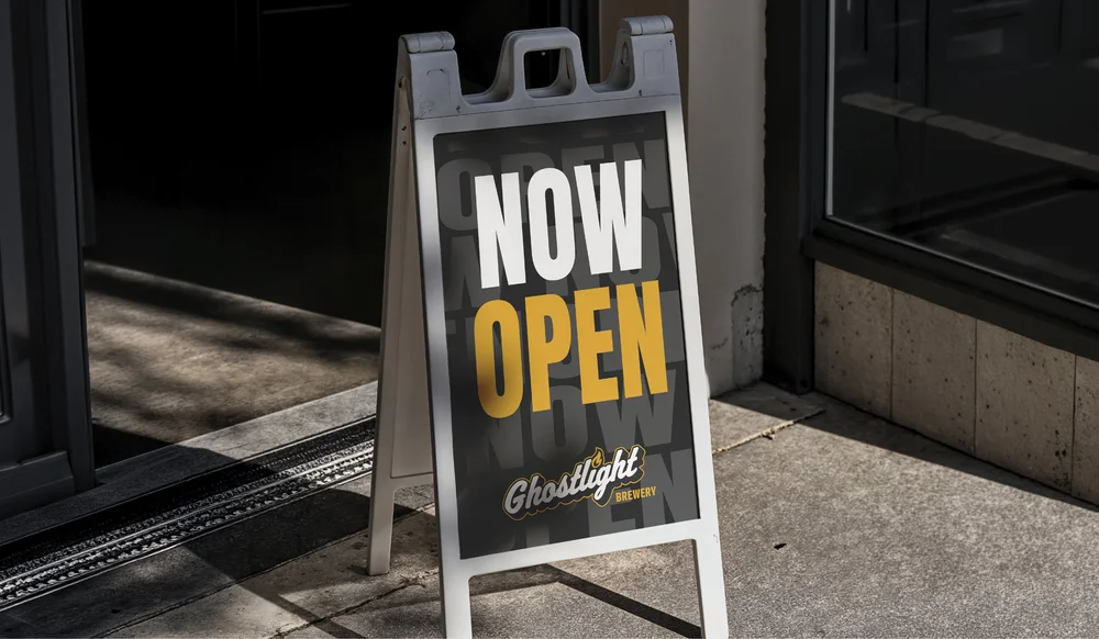
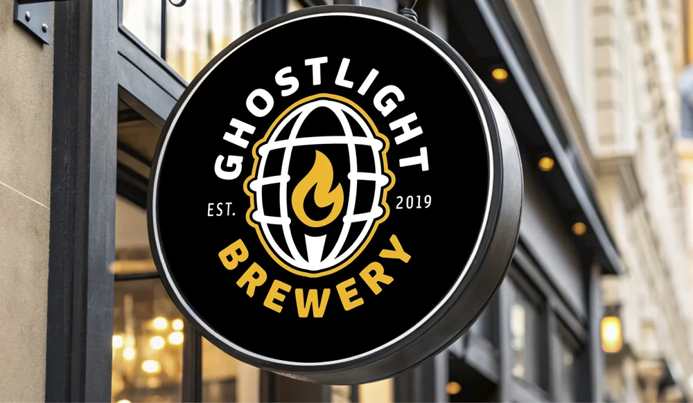
The original logo was created during college, and years later I revisited the project to redesign and refine it as my style evolved. The goal was to modernize the clean-up and structure while keeping the personality and theatrical inspiration intact. I wanted to improve readability, strengthen the typography, and create a more cohesive system that could work across merchandise, signage, and digital applications.
Solution
The refreshed identity keeps the ghostlight symbol at the center while introducing cleaner linework, stronger balance, and a more polished overall execution. The redesign focuses on scalability and flexibility, allowing the brand to feel more professional without losing its creative roots. The result is a bold, recognizable identity that bridges theater culture and craft brewing in a way that feels both fun and intentional.
Services
- Logo